I've been building open-source social networking software for the past four years, which has given me the unique opportunity to be involved in a wide variety of projects to build social networks and related tools. My experience has revealed a number of insights into the way that user interaction patterns are designed on websites that encourage a website's engagement and adoption to the point that it can grow organically from almost nothing – or, conversely, that doom a website to silent irrelevance in a distant corner of the web.
Unpleasant and unnecessary surprises drive people away.
This is essentially the Principle of Least Astonishment, and I actually think of it as two separate laws:
- Avoid ambiguity in user interfaces
- Don't be clever – just do the obvious thing
The first law, avoid ambiguity, says that the user should never be in doubt about what will happen when they take an action. For example, imagine you're creating an event on a social network and there is a checkbox labeled simply "Private." To you, the web developer, what this checkbox does might be obvious based on the way the website is designed – but a user might rightfully ask "private to who?" It is not immediately obvious whether checking the box makes the event private to only its creator, or private to its creator's friends, or private to everyone with an account on the website.
In fact, this is a very common question with Boolean switches. Consider the iPhone on/off toggle:
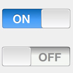
Which one is on and which one is off? Does the fact that the first switch says "ON" mean that it's on, or that it will turn on if I toggle it?
The solution depends on the situation, but in many cases it will involve both visual cues (when the iPhone toggle is on, it glows blue, like flipping on a light) as well as precise language ("Visible to friends only," not "Private"). In some cases, you may need to split the option or element you're considering into multiple elements, or possibly combine it with something else. Be careful not to overload the user with too many instructions, though. Interfaces should be intuitive. If it's too hard to figure out the system without reading instructions or just trying it, you need to redesign the interface, because most people just won't use it.
Where the first law is about avoiding situations where surprises may occur, the second law is about how to deal with surprises that occur anyway. Don't be clever. That is, don't think you're doing something smart by adding special behavior that people won't intuitively expect – just do the obvious thing. Often the behavior you think will be useful will really just be annoying.
Imagine, for example, writing a system for your website that supports Facebook-style statuses. You think about when you're writing status updates and realize how often you post something that you immediately regret, and so you write in a 10-second buffer so that if a status is posted within 10 seconds of the previous one it will automatically overwrite the older one. But then people start using your site, and their statuses start disappearing. It's not at all obvious to the casual user why an old status update would be overwritten. Although you wrote the feature to facilitate quick corrections, it gets in the way of people who just want to post messages quickly.
This law also applies to creating sensible defaults. Let's say you're creating a web content management system that allows editorial control over when content gets posted via a "Publish" checkbox. Leaving the checkbox un-checked by default means that when a casual user goes to write an article and clicks Save, their article will not appear on the site. Your system worked correctly, but the user was surprised and thinks your framework doesn't work. If the box was checked by default, the article would have appeared as expected, but the user would still have had the option to exercise editorial control once they grow comfortable enough with the basics to notice and care about it.
The point is that you want users to feel like they are in control over the system they're using. When something unexpected happens, the user has lost control and will likely also lose interest in your website. On the other hand, if everything works as expected, they'll be happy and more likely to stick around. Knowing what your users will expect is hard without testing, but in general following the example of other popular systems that people are familiar with is a good bet. Design for the average 80% of your users. If in doubt, go for the simplest solution.
Simplicity is better.
As with the Principle of Least Astonishment, I like to break this down into two separate ideas:
- Avoid information overload by only exposing the minimum required amount of information
- Don't make me think – all else being equal, users would prefer not to be challenged
Avoiding information overload usually has to do with how many graphical elements and how much text you're showing in a single interface. It's actually okay to have a lot of things on the screen if they're presented correctly – for example, if the important elements stand out distinctly from less important things. In general though, the fewer choices you offer and the more they are distinguished, the better a result you'll get. Often you can solve this problem by eliminating less important options, hiding less-used choices, or grouping together similar items. Another approach called Progressive Disclosure is to expose more complex options to users only once they are comfortable with the basics. There are many situations where this is appropriate, such as emphasizing common tasks, having "simple" and "advanced" interfaces, "read more" links, and "don't show this again" options. Just don't be too clever – if you try to automatically show and hide options, your users may be unpleasantly surprised to find things suddenly appearing or disappearing from the interface they're used to.
The second idea – don't make me think – is really about lowering the barrier to taking actions on the site. If a user has to think about where the "buy" button is, or if the price or specifications of a product aren't obvious, your conversions will drop dramatically. In a more subtle example, consider why status updates are such a successful innovation. When writing a blog entry, forum post, or other traditional long-form content on the internet, the user sees a large text entry box, usually with a WYSIWYG editor and often several other options. That's intimidating! When new users go to contribute content to the site, they're not looking to write an essay, and they're not yet confident that their opinions will be well-received by the other users on the site. They just want to post a few thoughts, test the waters, and get a response. In contrast to other forms of content, status updates have a small text box; content posts instantly without refreshing the page; and usually your audience is people (friends or followers) who are already interested in what you have to say, so the response is positive.
In other words, your goal is to get people to take certain actions on the site. Make those actions as easy to accomplish as possible.
Users want to feel valued.
There are three components to making users feel like a web community values their participation:
- Reputation – offering elements such as points, badges, and follower counts that demonstrate a user's reputation in the community
- Rewards – offering the user other benefits (such as discounts or privileges) in return for community contributions and achievements
- Feedback – users want the rest of the community to be active, and to respond to their opinions and questions
There is a growing amount of literature on gamification, so I won't delve too deep into the reputation component, but I will say that if you are building a community, the single most important thing you can do is make sure quality contributors feel like their contribution matters by recognizing their achievements. The easiest way to do that is by awarding points for contributing content. Rewards may or may not be appropriate for your site depending on what you're building, but it's the same idea – instead of awarding users after they've contributed, you are instead incentivizing them to contribute more. Reputation doesn't always have to be quantifiable (for example, it could just consist of recognition or deference from other community members) although it often helps if it is.
Stack Overflow is a great example of a website that uses reputation effectively. By awarding points and badges to people who contribute to the site, they give contributors a virtual pat on the back, encouraging them to contribute even more. (Not coincidentally, Stack Overflow also has a very low barrier to entry.) Pretty much every major retailer uses the rewards concept heavily to entice users to return and buy more products. In the end, users feel justified for their commitment to the website or service because they gain something from contributing to it. It's a positive feedback loop.
The other component of making users feel valued is making sure less-prolific users still get community exposure so that their content gets responses in the form of comments, "likes," ratings, or other messages. You can do this by featuring recently created content, by manually curating content, or by segmenting the users into smaller communities (such as geographical communities or friend groups) where everyone's content is more likely to become visible to people who are interested in it. Instant gratification is very important; there is a tangible difference between the satisfaction of posting a status update, which appears in your activity stream immediately, and of creating a forum post, where you have to wait for a page refresh and hope for comments that add make your thread valuable. Again, Facebook and similarly collaborative systems encourage contributions and responses by design by promoting interesting content making contributing an easy and obvious task. It sounds trite, but if you design your website with calls to action that are either intimidating or easy to ignore, people won't take action, and other people's experience on the site will deteriorate as a result.
Corollary: only show users content they're interested in seeing.
From all of the rules above, we derive the golden rule of interaction patterns: only show users content they're interested in seeing. It sounds obvious on the surface, but figuring out what users want to see is actually a complex topic.
The most obvious approach to solving this problem is to figure out what topics and kinds of content people are interested in. For example, you could do text analysis on people's posts as well as analyze the content they interact with on your site and then only show content that matches your best guess of their interests. This is an important technique on very high-traffic sites, but it's secondary to choosing an information model.
There are fundamentally two ways you can expose content on a website.
- Content can be visible to everyone, as on most forums; anyone who joins can interact with any content.
- Users can elect what content they want to see by "following" users or topics they find interesting.
There are sub-categories; for example, content can be segmented by groups where you have to join a group or be invited into it in order to interact with its content. However, the fundamental question is whether your experience is affected when any random person joins the site. On websites like Facebook, you only interact with your friends, and it doesn't matter when someone you've never met joins, because you'll never see them or their content. On the other hand, on websites like Quora or Reddit, anyone can join and contribute content or comment on your posts, so your experience is necessarily affected by the quality of everyone else's contributions to the site. In the second, open scenario, exclusivity (or similar approaches, like restricting functionality to users with fewer reputation points) can raise the quality of the site at the expense of the quantity of contributors.
The approach you should take depends on what kind of site you're building, but it's essential to get it right. In many cases users are only going to be interested in a small subset of the total content on the site, so you should try to emphasize that content to them, whether the content is segmented by the users who create it, the topics it addresses, or other qualities (like geographic location or the group into which it was posted). If possible, try to avoid showing content that users didn't explicitly ask to see. In an open model, this means categorizing the site to allow drilling down on interesting content (and probably also surfacing popular content).
All of these lessons are important guidelines for designing user interfaces, but the most important thing you can take away from this is a way of thinking about the way your users expect to be using the systems you build. I've tried to make the general rules more specific in this article, but it's really all about helping visitors enjoy your site by putting them in control, which means delivering on expectations and rewarding actions that make your site better. Even when you're focusing on avoiding unhappy surprises, there is still plenty of room for innovation – often the most-loved innovations come from new approaches to old problems that provide faster, easier, more intuitive ways to accomplish a task.